Wednesday, December 30, 2009

findings of the web


http://monsterbrains.blogspot.com/search?updated-max=2009-12-24T00%3A00%3A00-05%3A00

I'm trying not to pull you away from celebrating the holidays, but...
it's time for more FINDINGS OF THE WEB.


Looking for some drawing inspiration? Look no further than the sexy people blog.


http://www.sexypeople-blog.com/

Devoted to the perfect portrait, there is no shortage of bad hair, goths posing with Santa, ugly sweaters and interesting facial proportions.


You can also visit the rare book room!


Introduction to FontStruct from fontstruct on Vimeo.

You can make your own private downloadable fonts at fontstruct.

http://fontstruct.fontshop.com/


You can also check out the type cards from the old 1960's Batman series
http://www.batmania.com.ar/paginas/serie_onomatopeyas.htm


And lastly, if you need shoe references I suggest going to The Piperlime. You can see and save a shoe from several different angles and they have hundreds of shoes to choose from. I suggest the "larger view"

http://piperlime.gap.com/browse/division.do?cid=15957

Tuesday, December 22, 2009

Our product is so "you"

As boomers get older, there seems to be a push to make "generation y" the new "ME generation."


Thanks guys. Without all your products, I wouldn't know how to express myself. I might have to turn to things other than mayo for my rebellion.

Tuesday, October 27, 2009

Today

Graphic Design pro, Anissa Smith, came to my school to speak to us. Amongst lots of great advice on recession-proof aggressive self-marketing and networking, she also had this to say. In the mean time, when you don't have a large amount of jobs coming your way, create projects for yourself. I know, I know, that's not exactly a new idea, but she made a great point. With as much great and inspiring design there is out there (in the wild yonder), there is even MORE crappy "design." Her advice was to look around you, see the garbage, and redesign or fix it. This is a cross-platform idea. No matter what field of design or creation you are in, there are a lot of things that make your eyes hurt. Just thought I pass it along. Back to work

-Grace

P.S. Oh, she also mentioned that the government is considering a large bailout for the newspaper industry. Am I the only one this strikes as a bad idea?

Sunday, October 25, 2009

I'm not into latex or anything but

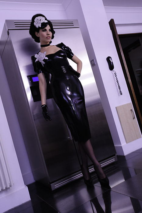
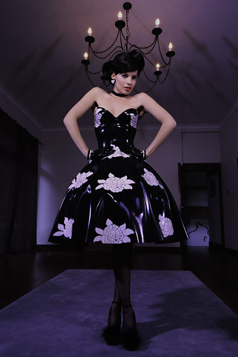
Have you noticed the appearance of latex in more and more live-action renditions of comic books? Well, it's not such a big leap. A lot of latex designers (past and present) seem to have been influenced by characters' costumes. I find not only this interesting, but also the kind of clothes they are now able to make now (scroll below.) For those who might not know, latex is a "no-sew" fabric. Pieces are just glued together. It is pretty cool to see some of the intricate (usually sewn) pieces designers are now making. The next few pictures (+plus links) are some of the least disturbing (sexually or otherwise) photos of costume-influenced or complicated (the way it's made) latex clothing I have found online.


http://www.leehiggs.com/gmac/gmac.html


http://viewmorepics.myspace.com/index.cfm?fuseaction=user.viewPicture&friendID=377717663&albumId=771189


I could never get over how uncomfortable the stuff is though.


http://viewmorepics.myspace.com/index.cfm?fuseaction=user.viewAlbums&friendID=34724502


http://www.ashworth-photos.com/fashion/fashion_series20.html


http://viewmorepics.myspace.com/index.cfm?fuseaction=user.viewAlbums&friendID=65757431


http://www.house-of-harlot.com/shop/home.php

This last one looks like it was influenced by "The Spirit."

a blog post about not having time to post

Right now I'm taking 5 senior design classes and working 3 days a week. I haven't had time for anything else, let alone blogging or having some type of social life. I talked to my friend (and co-worker) Damian and he suggest I post more. He's right, so I'll write about my summer.

I feel like I squandered it. I started about 10 projects for myself, lost focus, and finished none. I would begin one and get scared that I was runing out of time for all the rest. Then I would start another and then do that again and again, until I really did run out of time. Lessoned learned! When the semester is over, I will start and complete one project at a time. *promise*

What else? Right now, most of the sketching I'm doing are of logos and icons. I'm not sure if they are of any particular interest to anyone. Speaking of, I looked down at the bottom of this page and saw the number of views. I don't know what I did, wrong or right, but thanks for looking?

There have been some interesting things I found online a little while ago, but I don't know when I'll get a chance to write about them. The next post I put up will be one I started months ago about the comic book industry's influence on latex clothing designers. AND there'll be pictures!

Thursday, July 23, 2009

Sunday, July 12, 2009

digital coloring books and Colourlovers experiments= fun


I got this page here.


Lately, I've been finding pages like this from all manner of publications, including coloring books. I actually miss filling in these things. The two results here are part nostalgia and experiment.


...all the wrong colors


I used a color palette uploaded/created by a user named angelafaye on the COLOURlovers website. Here is the palette (above.) I found them (C lovers) just the other day and saw some things that had fun potential. A user can create and save color pallets on their page. These color groupings are available (to members) for download in a number of different file formats or a zip file filled with the above assortment. There is also an option to name (previously unnamed) colors or create palettes by plugging colors into predetermined patterns. Membership is also free. My only pet peeve with the site is it's user-unfriendly navigation, which it shares with other web 2.0 layouts.


One option in creating color schemes is "Copaso." It is found under "Palettes" in the main navigation bar. Here you can choose colors based on scheme, profile, code, or an image from your computer/flash drive. You can then save the results when you are finished.


"Photocopa" (found also under "palettes" in navigation) is what has sold me on this site. You can plug in an image's url and find out what colors were used. It also splits those colors into several schemes for you (see below.) Have a painting from an artist you've been trying to figure out? Well, now you have your answers. Want to see the different flesh tones of a particular model? Here ya' go.


I will digitally paint the coloring book pages I find with the palettes I make on COLOURlovers and post them here.


Oh, and if you have patience skimming through their blog (COLOURlovers) you can find interesting stuff there from time to time. Here they dissect corporate brand colors:

http://www.colourlovers.com/blog/2008/06/20/the-colors-of-global-brand-identities

Some of the links there aren't bad either. This an article on the color pallets of the most top-grossing films' posters.

http://www.underconsideration.com/speakup/archives/003641.html?source=rss

Sunday, June 28, 2009

pity party

Today the MTA (Metropolitan Transportation Authority) raised fare prices. The only people I have talked to (who) are in favor of this hike have been upper middle-class workers. They seem to have forgotten what it was like to be student or someone with a fixed income. Sometimes its hard knowing that the city you love so much, may not want you.

----------------------------------------------------------------

Anyway, expect some posts featuring work from my other classes this semester. I realize that time is running out. It won't be long before I'm to busy to make blog entries again. Currently, I seem to be going through some type of design ADHD (Attention Deficit Hyperactive Disorder.) Hopefully, everything will even out and I will complete one of the (many) projects I have created for myself, by summer's end. Oh, and before I forget, The Common Threads Art Committee (for which I am a member and cofounder) just got accepted to be apart of a street festival happening this upcoming October on 14 st (NYC.) We spent 2 days writing up a proposal and I must say, I am ecstatic that our hard work paid off! So I guess, my pity party is over after all. See 'ya soon

-Grace

Thursday, June 18, 2009

Pac Man Challenge

My former employer is having a Pac Man contest here in New York City tomorrow (Friday.) Visit the link for more details.

Wednesday, June 17, 2009

what does secretive happiness look like?


After I got my formula for "secretive enjoyment" (involves tilted heads and smiling eyes) down, I thought long and hard about what the characters for Kept chocolate should look like. I used the 90's girl appeal formula: one long-haired minority + one short-haired "sporty" girl + one full-headed "girly girl" = fun. Proof of this? Think of movies like Clueless and Charlie's Angels.


This girl (above) was based on two sketches from the last sheet of paper (further above.) As you can see, she wasn't based on any type of human anatomy. I tried to force a bunch of stylized curves into what I thought would be cute. I wound up with a bit of grief instead. More on that a little later.


Here are the original girls! The black girl has an afro only because I wore one (myself) in a show around the time of her conception. Do you like her fingers? My "girly girl" (next to "old") is the only drawing here based on a real person. She was too detailed. As for the "sporty girl," I was told to fix her arm. Understandable! I later went and surveyed 5 guys on what they thought of the characters. Their main "concern" was with our short-haired friend here. I was given a laundry list of changes to make. They included longer hair, bigger boobs, hips (she's a torso,) and a bigger butt. They felt she looked like a man. I'm still a little confused by that one. Here is my compromise just below.


New and improved! The girls seemed very happy about their changes.


These are examples of the color variations the character boxes went through. [Volcano color scheme above.] Sorry about the aliasing. I don't know why reds do that here.


Here (above) are some of the other cover tests.


A blurry chocolate set test.

The next Kept post will include that finalized box designs.

Friday, June 12, 2009

more chocolate


Here are some of the "lavish box" color schemes I made for that chocolate project (mentioned previously). They are based off some color research I did and those volcano pictures you saw in my last post.  This is also how I knew what the printed colors would look like.  Remind me to tell you about mood books later.


These were some of my initial patterns (above and below) for the other packaging direction of Kept.  I posted a tutorial on the one above a little while ago.  Well, my professor disliked most of these patterns and told me that I needed to work on them more. 


After sulking a bit, I got some new art supplies and began work. Would you believe I had so much fun? All in all, I created over 48 cover designs, not including colors or variations. A lot of students complain about "picky" teachers, but I can honestly say (during this project) I learned that you don't have to sacrifice value or aesthetics to meet a deadline. You can have both!  There are a few sleepless nights, but it's worth it all in the end.


Some of my fun.


This (above) is a preview for my next post, "the girls" of Kept Chocolate.

Thursday, June 11, 2009

kept chocolate: colors, logos, and concepts


Why was my assignment named Kept?  Well, I felt there was limitless play with a word associated with so many things.  

1 have or retain possession of my father would keep the best for himself she had trouble keeping her balance.
 • retain or reserve for use in the future return one copy to me, keeping the other for your files.
 • put or store in a regular place the stand where her umbrella was kept.
 • retain one's place in or on (a seat or saddle, the ground, etc.) against opposition or difficulty are you able to keep your saddle?
 • delay or detain; cause to be late I won't keep you; I know you've got a busy evening.

2 continue or cause to continue in a specified condition, position, course, etc. [ intrans. she could have had some boyfriend she kept quiet about keep left along the wall | [ trans. she might be kept alive artificially by machinery.
 • [ intrans. continue doing or do repeatedly or habitually he keeps going on about the murder.
 • [ intrans. (of a perishable commodity) remain in good condition :fresh ginger does not keep well.
 • [ trans. make (someone) do something for a period of time I have kept her waiting too long.
 • archaic continue to follow (a way, path, or course) the friars and soldiers removed, keeping their course toward Jericho.

3 provide for the sustenance of (someone) he had to keep his large family in the manner he had chosen.
 • provide (someone) with a regular supply of a commodity the money should keep him in cigarettes for a week.
 • own and look after (an animal) for pleasure or profit.
 • own and manage (a shop or business).
 • guard; protect his only thought is to keep the boy from harm.
 • support (someone, esp. a woman) financially in return for sexual favors[as adj. a kept woman.
 • [ intrans. act as a goalkeeper.

4 honor or fulfill (a commitment or undertaking) I'll keep my promise, naturally.
 • observe (a religious occasion) in the prescribed manner today's consumers do not keep the Sabbath.
 • pay due regard to (a law or custom).

5 make written entries in (a diary) on a regular basis the master kept a weekly journal.
 • write down as (a record) : keep a note of the whereabouts of each item.

That and I like secrets.  As I told my professor (when I was pitching the idea) not deep-dark-hateful-family-secrets.  No no no.  Fun-playful-tasty-whispery-secrets, like the kind teenage girls share... or at least used to.


When I created my chocolate company, I thought the package direction could go one of three ways.  As you can see above, those choices were lavish (gold lettering,) funky, or  fun/funny.  In the end, I used all three.


Look at this crummy subway sketch.  Anyway, I liked the idea of having tiny boxes that could stand alone or be sold together in a variety pack.  I felt the small packaging could be a play on "small treasures" or "kept secrets."


A bit more fleshed out.


When creating our logos, we weren't allowed to draw them up ourselves. We had to "build" them out of previously created fonts.  My workmark (then) was a mixture of two fonts.  I thought the silhouetted letter shapes were fun and youthful.  I especially liked the key shape made in the negative space between the e and p. (Above)


What colors make you think of chocolate? Well, when I showed people these National Geographic volcano photos, they thought I was crazy for thinking they looked tasty.  I went and did a bunch of (Western) color research anyway and just made sure to include similar colors in my palette.  In my research, I learned things like lavender is a "grown up" pink.  Who knew?


Here (above) are the swatches I seperated into color schemes (I'll post some later) and a few"lavish" box cover ideas.  The lettering is supposed to be gold or silver foil.  These colors are much darker when printed.  I put the color schemes together using printed swatches.


When I pointed the key shape out (in my logo) to my professor, she suggested that I bring some more attention to that area.  Here are some tests and the finished product (above).


This is a more completed box.  I will post the pattern ideas for Kept next.